TWIC: The Screenwriter/Business Card Conundrum
This Week in Coaching – Week ending 12/13/19.
Do screenwriters need business cards?
This question has come up so many time! It seems like such a trivial detail, and one that should have a clear YES or NO answer but yet…
Over the years, I’ve seen people cringe when talking about screenwriters and their sometimes memorable-for-all-the-reasons business cards. And I get why: We’ve all seen some really REALLY bad ones. Business cards with too many words. With images that immediately date the writer. Cards that come off as trying too hard. Printed on too-pricey stock, working overtime to impress, while undeniably sporting amateurish design, probably generated on the writer’s very old home computer. Embossed. Gold stamped. Encrusted. Sleeved. Sporting hard to read, all-too-sophisticated a font. Or otherwise, a business card that does wayyyy too much: Delivers not only the writer’s contact information, but also a logline in tiny, almost unreadable font to make it all fit on one standard sized card. Or, worse yet, cheesy wannabe key-art that comes off as unprofessional a lot more than it is unforgettable.
So… What’s a writer to do? How is a writer to communicate his contact information, without coming off as too eccentric, too eager, trying too hard?
I go back to one simple truth: Business cards remain the one way in which professionals share their contact information. Writers are, in their own right, professionals any time they present themselves in a writerly capacity. Writers should, therefore, and in my humble opinion, be able to offer professional looking business cards. While offering, maybe, possibly, a bit of a creative flair, in context.
My friend Jeanne Bowerman, talented writer and editor of Script Magazine, included the line “writer of things” under her name on her business card. I always loved that, as it was unassuming, clear, simple and elegant.
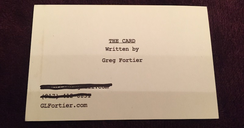
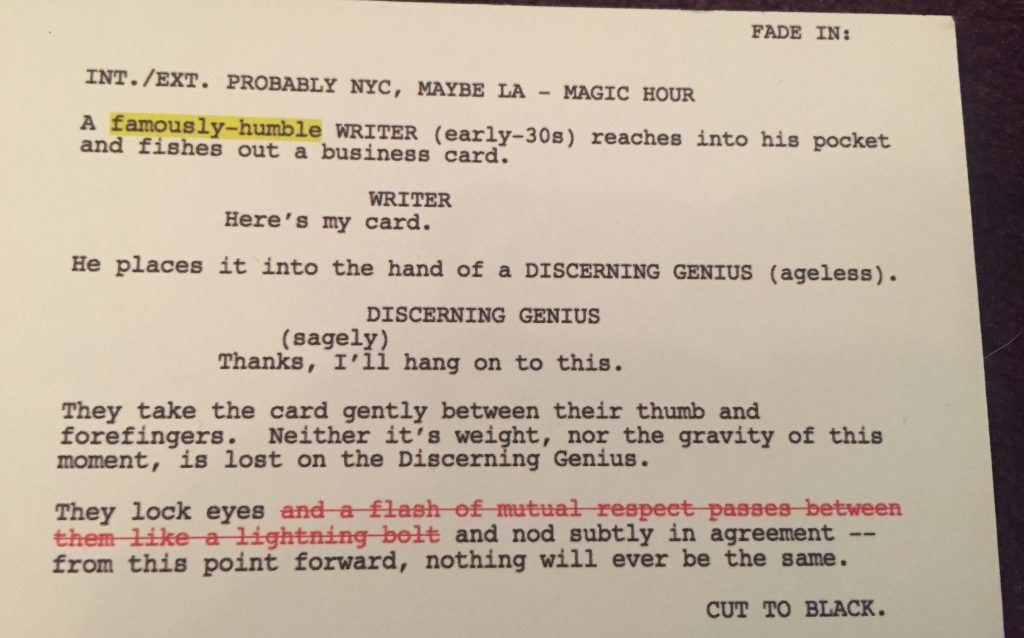
Over the years, I’ve kept an eye out for those cards that do the job, maybe even set the tone, without doing too much. Which is exactly what I found when my client Greg shared with me his business card, ahead of his trip to the Austin Film Festival this past October.
Greg is a smart guy. A comedy writer. A comedy writer who, in fact, went on to win the comedy category at the Austin Film Festival Screenwriting Competition so in retrospect… good thing he brought business cards! And Greg – who said I didn’t have to change his name in this blogpost – generously said I could share images of his card so… here we are!
(for the record, there is a typo in the above card. which I am aware of. but it just goes to show… when you do something right, you can get away with A LOT).
This is, by no means, a business card template that everyone should follow. Instead, it’s just one example (and I have seen a good few over the years!) of a business card done right. Done tastefully. With an eye to the market and current styles, in a way that’s memorable but – at least for me, and it is a taste thing – not obnoxious. Greg’s is one of the very few heavily worded cards I’ve liked over the years; but then, I’m the sort of girl who would happily settle for minimal information done with a nice little logo and a refined, but not too pretentious, font.
The bottom line? If you choose to bring business cards with you, make sure that they are well designed, unpretentious, and simple enough. If you are able to be funny without trying too hard (that is, assuming you’re a comedy writer), go for it. If a friend can design a logo for you that alludes to the fact that you are a horror writer, all the better. Remember that business cards have an important function: to transmit your contact information. So make sure that they represent you to execs, reps, colleagues and other writers in a way that you can be proud of.
I take it his contact info was on the reverse side of this card. I like it though. Cheeky.
I love his card, I had a similar business card idea last year but I went with something else.
As a marketing person, kudos for the guts to do this. Still, not sure this is my way to go. I have created a brand of thrillers I call @skinnystories. They are always under 100 pages, under $10. the right length to read on a Kindle or a pocket-able paperback.
I have done a Facebook page called Thriller She Wrote. My biz cards carry info about my books along with pictures and how to purchase on Amazon.
I am planning on bundling the Trilogy Assassin Games, Huntdown and Final Heat and pitch as a TV show on one of the new streaming platforms.
Any advice?
Thank you for you expertise. This is a new industry for me.